One of the most regular ways users in Calpendo interact with a calendar is through the booking window. In our previous versions of Calpendo we could do a reasonable amount to configure the booking window to follow a bespoke design.
In version 10 we can now configure the booking window layout in even more detailed and user-friendly ways for your system. We believe these changes can make the booking process even more powerful and flexible to your facility and user’s needs.
In this blog post I am therefore going to take you through some of key changes we have made to the booking window through some quick examples.
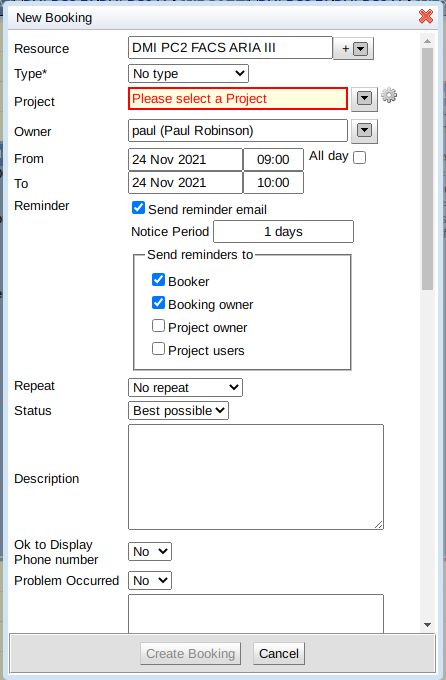
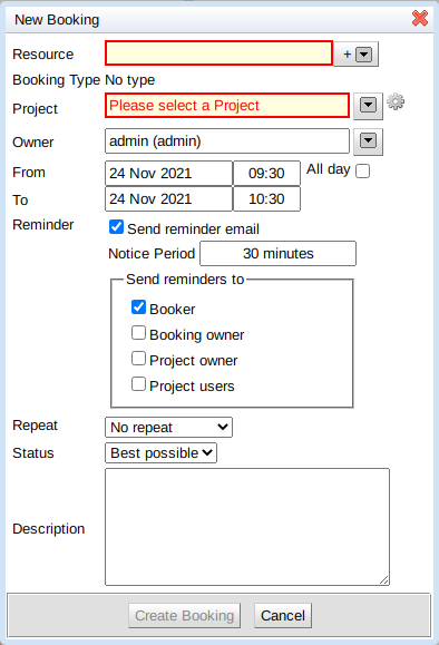
Before we take a look at what you can now do with booking windows let’s start with the standard window itself as you can see in the screenshot below. A resource and project still need to be chosen for this booking.
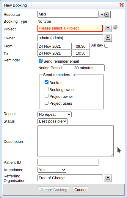
Additional custom properties might be required on a booking depending upon what it is that is being booked. For example, some microscopes require that you specify the temperature it should be set to, while some life sciences bookings might require you to enter information about the patient attending the booking. Here’s an example of what you might see making an MRI booking where there are three new custom properties added, all of which appear at the end:
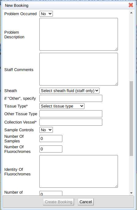
Calpendo has always allowed custom properties to be added like this. For bookings, it works well when there are a small number of custom properties, but there are display issues when there are many additional properties as they are displayed at the end in one long list. Here’s a real example of a booking entry form for a cell sorter with 21 custom properties added. As you can see, people using this would have to scroll a long way to see everything. There was also no way to provide any kind of logical grouping to the information displayed:
Calpendo has a layout tool which, up until now, was largely used for projects and service orders. The layout tool lets you specify how to display something, perhaps with information split out into tabs and other logical groupings.
But this feature hasn’t worked with bookings until Calpendo version 10.1.
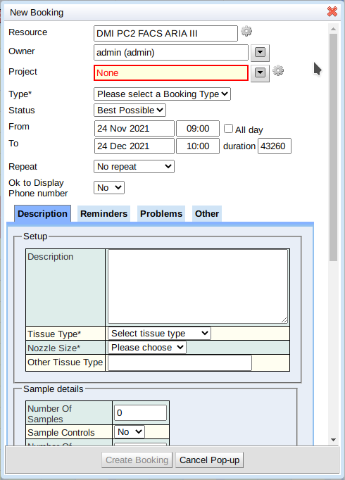
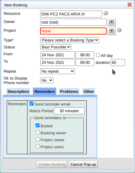
Here’s a booking entry form for the same cell sorter, but now using layouts to control the display.
Reminders have been moved to their own tab:
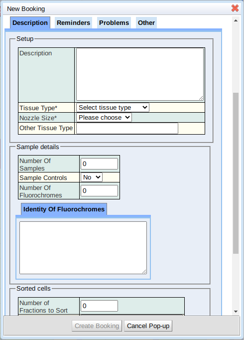
and additional tabs have been set up for other properties:
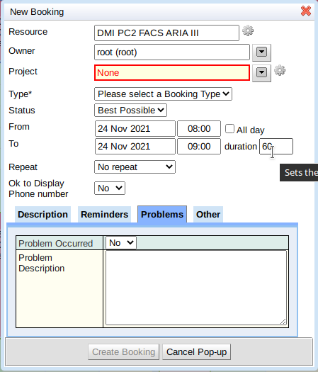
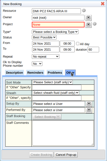
The layout facility means you can now control how the form looks, and provide a logical representation for it in a way that makes sense.
As well as placing properties into tabs, you can also use some other tools, such as grouping inside a caption panel. This ability to group data properties in different ways will help for booking windows which require large amounts of information. For example, that last “Other” tab might have been laid out like this:
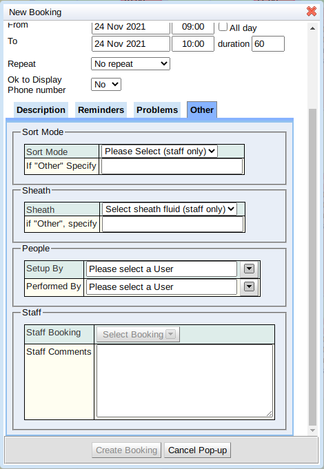
In addition to the calendar displaying the new booking window layouts if you access a booking through any other means such as a search page or a link from a service order, it will also display using the new layout.
To see more details about the layout editor and how to use it, look in our reference documentation.
If you are an existing customer and are interested in having some of these changes implemented send us on email at support@exprodo.com and we will be happy to help. If you are not using Calpendo yet and are interested in what we can do for you let us know here and we will get back to you.
